Jinn
A BSc Psychology and Bachelor of Game Development Graduate.
A quick learner and gamer full with passions.
Do visit my LinkedIn for more about me.
Some Thoughts On Quest System
Quest system is not something novel. Nowadays, it can be seen in almost every game. Most of the open world games have a dedicated user interface for the quest system in order to guide players about their current game state objective. Generally, quests are categorized into main quests and side quests. Main quests advance the storyline while side quests help players to increase levels, gather resources or improve equipment. Quests help introduce the game world and make it more believable to players. Most of the time, players are given the freedom to complete any quests they would prioritize, especially in an open world RPG game.
When there is a large space, minimap is utilized to give a sense of direction to players and guide them to their desired destination. Minimap is also designed to help players in completing the quests without repeatedly switching the quests system user interface and the game scene.
A Little Thing That Annoys Me In An Open World RPG Game
If you have played any open world RPG game, you may have encounter this tiny issue that bothers me sometimes. In general, there is always a dedicated quest menu screen in an open world RPG game. As the game progresses, I tend to accept any kind of quests as the first sight of seeing them available to be added into my quest log (I wonder if anybody will only accept new quest when he/she finishes a quest). There are plenty of reasons to stack tons of quests in the list: Do not need to return to an area twice, do not need to remember where to accept the quest, can complete multiple quests in one trip etc.
Here comes the little bit that bothers me: Browsing through the quest menu.
Imagine this, you have just traveled for 2 hours in the game to reach a castle and completed a quest. Now, there are actually plenty of quests to be completed in the area. However, without checking the quest menu and select the mentioned quest, the system will ‘randomly’ pick a quest that may or may not relate to the area. To avoid wasting time on travelling, you just have to pause the game, get into the quest menu, find the nearby quest that is not too diffcult for your character level, select it as current quest, and finally continue the game.
And this happens a lot as I have stacked up tons of quests in my to-do list.
As an open world RPG gamer, you probably have experienced this immersion breaking issue. Not to mention if a game quest menu is poorly designed and we always have zero time to be wasted on searching something through tons of texts.
Quest System In Witcher 3 Wild Hunt
I just got my hands on Witcher 3 Wild Hunt recently. Without a doubt, it is a fantastic game and of course, the quest system bothers me a little which leads me to here, complaining discussing the issue through my perspective.
I love the game and probably should take some other game as references too. But well, it is the most recent open world RPG game I am still playing. So here we go.
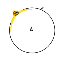
Help From Minimap
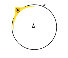
The picture above is the outline of minimap in Witcher 3 Wild Hunt. While the triangle indicates the player’s direction and location, the yellow shape with a black diamond in the middle indicates the current quest direction and location.
Players may encounter a quest with more than one goal sometimes, for example, talk to villagers or go to hunt directly. The size of the indicator tells players the distance between the player character and the location of the goal.
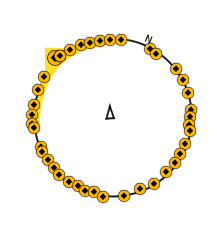
When all the quests are shown in minimap, the information presented to players will be overwhelming. While the objective is to reduce the need of players switching between game scene and quest interface, this does not help but makes the situation worse. Overwhelming information and with no indication about the quest description will only make the player experience worse than the previous version.
Outline Of UI In Witcher 3 Wild Hunt
This is part of the game scene UI in Witcher 3 Wild Hunt. I’ve omited those that aren’t really related to quest such as health, skill, item etc.

Modification From Existing Quick Access Menu
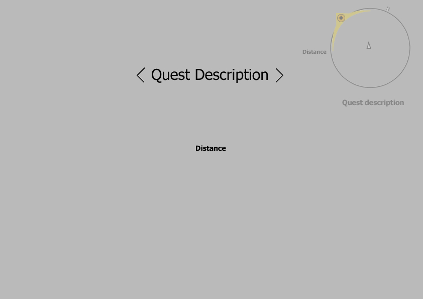
Instead of squeezing all the information into minimap, a possible solution can be somewhat similar to its in-game quick access user interface. After players press the button, a quick access menu can pop up. The menu consists of quest description and its distance. Players will be given the choice of browsing through different quests with analog sticks or buttons. However, this may turn out to be cumbersome when tons of quests are accepted and queuing up. The large amount of tasks from main quests or side quests is not unfamiliar to any open world RPG gamers especially when they are quite the adventurous one.
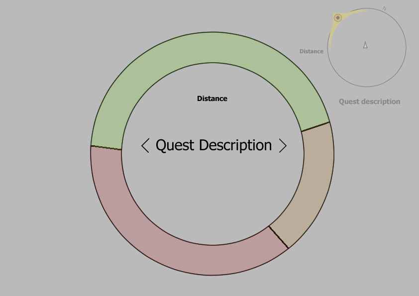
Derived from previous idea, this can be replaced as the quick access quest menu. Similar to before, there are distance and quest descriptions with an outer ring that guide the players focus on them. In addition to direct players focus, it also makes the information more interesting as there isn’t merely words anymore. The outer ring consists of three parts in the above picture. It stands for the priority of the quests that can be set up in the classic game menu. The size/percentage of a part indicates the amount of quests in that particular priority. In this example, there are 3 categories representing priority but it really can be replaced for anything that suits the gameplay experience, for example, side quest and main quests, the difficulty based on level, the distance from current player location etc.. It can even be replaced by icons or pictures as what Witcher 3 did for the skill, Sign, quick access menu. The sky is the limit.
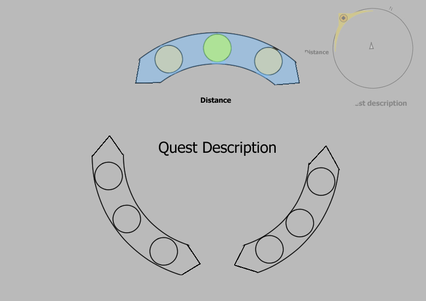
This is another example. Instead of a connected ring, this is separated into 3 chunks. While controlling with analog sticks, the blue chunk indicates current selecting chunk and the green circle represents current viewing quest.
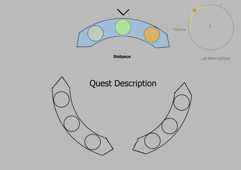
Of course, an arrow indicator can be added and color can be used to differentiate the current selected quest or current viewing quest. However, this goes against the goal of a quick access quest menu. First of all, the information starts to overload as multiple colors representing various information. Especially there isn’t any description about the color. Players then have to remember what the colors represent. Second, it complicates the quick access quest menu because the extra control keys have to be used to browse through chunks and quests. Of course, this does not mean it is useless. It just does not fit into my personal idea of smooth user experience. Things may turn out completely different from my assumption once it gets tested. The feedback is certainly more important and ‘correct’ as the whole idea is about user experience.
Conclusion
This may or may not bother players but personally, I do think that keeping user experience in mind while designing the quest system (in terms of User Interface/Interaction) will provide a better and smoother gameplay experiences to players like me.
P.s. May chip in more on this topic if I have time (to include other game as references) or the idea light bulb just decides to pop up from my head.